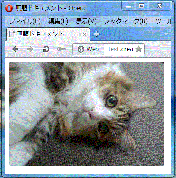
正方形の画像を角丸で表示したい時の指定です。
<!DOCTYPE HTML>
<html>
<head>
<style type="text/css">
.shadow img{
	border-radius: 3px;
	-webkit-border-radius: 3px;
	-moz-border-radius: 3px;
	display: inline-block;
}
</style>
<meta http-equiv="Content-Type" content="text/html; charset=utf-8">
<title>無題ドキュメント</title>
</head>
<body>
	<div class="shadow"><img src="images/nyan.jpg" width="320"></div>
</body>
</html>
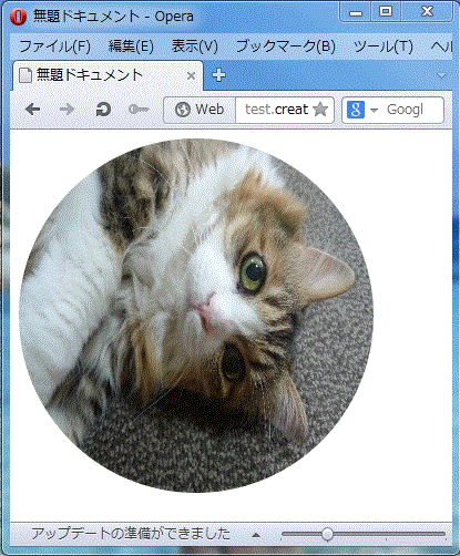
正円形にする場合には、正方形の画像じゃないと難しいかな?と思います。
<!DOCTYPE HTML>
<html>
<head>
<style type="text/css">
.shadow img{
	height: 320px;
	border-radius: 160px;
	-webkit-border-radius: 160px;
	-moz-border-radius: 160px;
	display: inline-block;
}
</style>
<meta http-equiv="Content-Type" content="text/html; charset=utf-8">
<title>無題ドキュメント</title>
</head>

<body>

<div class="shadow"><img src="images/nyan.jpg" width="320"></div>
</body>
</html>
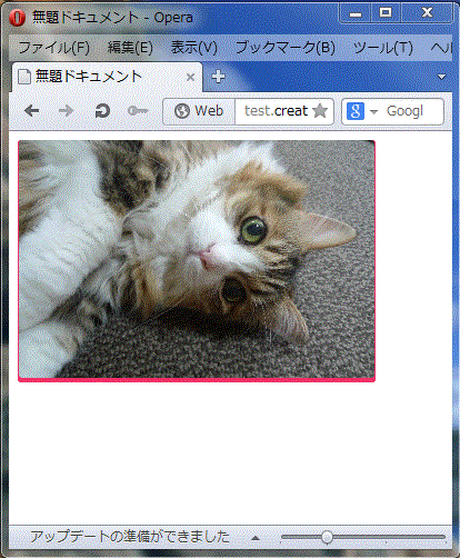
おまけ:シャドウも付けてかわいく縁取る
<!DOCTYPE HTML<
<html<
<head<
<style type="text/css"<
.shadow {
	width:320px;
	border-radius: 3px;
	-webkit-border-radius: 3px;
	-moz-border-radius: 3px;
	border-bottom: 5px solid #f23064;
	border-left: 1px solid #f23064;
	border-right: 1px solid #f23064;
	background: #f23064;
}
.shadow img{
	margin: 0 0 -3px;
	border-radius: 3px;
	-webkit-border-radius: 3px;
	-moz-border-radius: 3px;
	display: inline-block;
}
</style<
<meta http-equiv="Content-Type" content="text/html; charset=utf-8"<
<title<無題ドキュメント</title<
</head<

<body<

<div class="shadow"<<img src="images/nyan.jpg" width="320"<</div<
</body<
</html<
使用した画像

写真AC > 生き物 > ネコ